
A meaningful name deserved a meaningful mark.
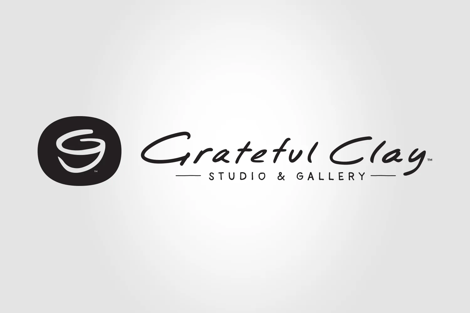
For Grateful Clay, we created an identity rooted in the personal story behind “Grateful,” while keeping the look natural, individual and handcrafted.
The mark combines the initials G and C into the shape of a pottery cup or bowl. The name was scripted by hand and refined without losing its personality—resulting in a warm, organic signature for a studio shaped by hand and built from gratitude.




Whatever your creative needs are, Birch can help. Not sure what you need exactly? We can help there, too. It all starts with a call, or an email. Reach out and see what we can do.
Connect